The four things that make a photo print well
A photo that looks fine on a phone can still disappoint in print. Cards are small and detailed, so the image needs to hold up when it is sharpened and printed at 2.5" x 3.5". Four qualities decide that.
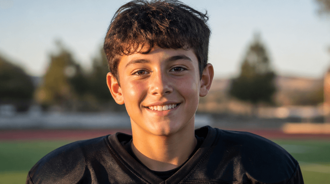
- ✓Focus — the athlete should be crisp, not soft or motion-blurred.
- ✓Lighting — even light beats harsh shadows or a dark, underexposed frame.
- ✓Resolution — bigger files print cleaner; aim for at least 1000 pixels on the short edge.
- ✓Framing — keep the athlete clearly the subject, with breathing room around them.
Action shots vs. portraits
Both styles work — they just feel different. An action shot mid-swing, mid-jump, or mid-stride brings energy and movement, and tends to look striking in bold templates.
A posed portrait in uniform is calmer, easier to crop cleanly, and reads well in classic or vintage designs. If you are not sure, a sharp portrait is the safer pick; if you have a great action frame, use it.
What to avoid
Most disappointing cards trace back to the photo, and the same handful of problems come up again and again. None of them can be fully fixed after the fact, so it is worth screening for them up front.
- ✓Heavy motion blur or out-of-focus subjects
- ✓Very dark or backlit shots where the athlete is in shadow
- ✓Tiny, low-resolution images saved from social media or texts
- ✓Busy backgrounds that compete with the athlete
- ✓Screenshots — always use the original photo file instead
A quick pre-upload checklist
Before you upload, run the photo through a fast mental check. If it passes these, it will almost certainly make a strong card.
- ✓Can you see the athlete's face or form clearly?
- ✓Is it the original file, at full size?
- ✓Is the lighting even, with no deep shadow on the subject?
- ✓Is there a little room around the athlete to crop?